ViewShift
A downloadable game for Windows, macOS, and Linux
Download NowName your own price
This is a game made for the 3rd Nokia 3310 Game Jam, held with the theme:
ON / OFF
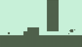
Since the original Nokia 3310 had subtle lines separating its pixels, I thought I would add it as well. It follows the 84x48 restriction, and adds no disallowed detail otherwise.
I've hidden the versions with music, since it didn't feel Nokia. (I already had the music-less uploaded at the start)
Controls:
| Move Left | Left Arrow / Num 4 |
| Move Right | Right Arrow / Num 6 |
| Jump | Up Arrow / Num 8 |
| Switch | Space / |
Sadly, I accidentally bound some Num keys incorrectly, so switching with Num 5 does not work...
| Status | Prototype |
| Platforms | Windows, macOS, Linux |
| Release date | Feb 08, 2021 |
| Author | kintrix |
| Genre | Platformer |
| Made with | Godot, GIMP, Audacity |
| Tags | 1-bit, 2D, nokia, Puzzle-Platformer, Retro, Short, Singleplayer |
| Average session | A few minutes |
| Inputs | Keyboard |
| Accessibility | Color-blind friendly, High-contrast, Textless |
Download
Download NowName your own price
Click download now to get access to the following files:
Viewshift - No Music 121 MB

Comments
Log in with itch.io to leave a comment.
Amazing game, needs more recognition, I love the ending screen since the "Thank You" is drawn in this great style, and the idea for the game is fantastic aswell, the puzzle elements are really engaging, but i do have some critique, one of them is the music, it doesn't really fit to all of the nokia vibe, also the spikes, its so hard to tell which you can step on and which you cannot, i know it would be hard to make the spikes different in a 1 bit style with such little resolution, but i bet there could be solution to this... i've included a screenshot of the spikes, green = i can walk on it, red = i cant walk on it, you can see how it gets a bit confusing, although i did like the grid ontop of the pixels, it adds a nice touch, and a little bit of critique about the website... i really don't like the dotted background, it hurts my eyes after a little while...
Here is the screenshot of the spikes : https://imgur.com/a/ekP7qYh
Great game tho, should be higher up on the submission page, i bet if you could export it into html5 it would have gotten way more traction!
I agree with everything you said. The spikes was something I was thinking about, and I sort of came up with a solution, but I didn't have time to implement it. This whole project was a race against time, since I pretty much only had my Sunday free to work on the game.
(Yeah, I have them excuses) :D
I'm gonna switch the background... When I made it I was already half asleep.
And yeah, I was hesitant about the music, since... it didn't really feel Nokia, but I'm terrible at composing, so... That is why I added a music-less download. I was planning to add an options screen, but ran out of time.